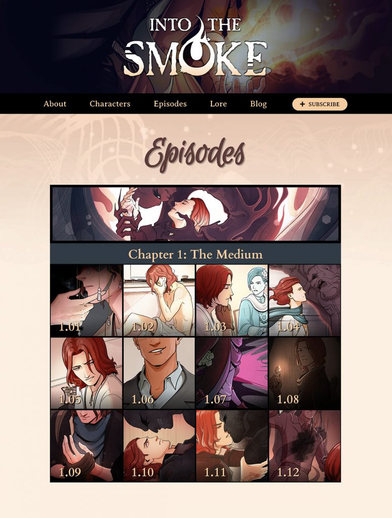
Welcome to our brand-new, shiny website! I’m thrilled to finally share it after lots of behind-the-scenes work! It’s a pretty straightforward site, but it has some exciting things going on under the hood too.
My Favorite ITS Website Features
1. It’s responsive, so you can read comfortably on desktop and mobile.
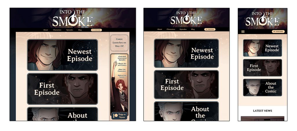
Vertical-scroll webtoons are typically designed for mobile readers, and I’m so happy with how the comic reads on my iPhone. But as someone who primarily works from a computer, it was important to me that the comic and website look good on desktop too. The episode images are displayed a little narrower on desktop to ensure you get some good vertical heigh for the tallest panels.
2. It’s a webcomic site!
I mean, obviously it is. But I wanted to make sure it had all the features that are important for webcomic readers: a clean archive, pagination, a skip-to-top button that’s handy for long vertical episodes, comments, and more.
3. The front end is very nice
In other words, it’s easy to design, update, and maintain. Why should anyone other than me care? Well, the easier it is to update a website, the more often it’ll be updated!
4. It’s an accessible webcomic site!
Artwork and images have alt text, including every individual panel of the webcomic. In addition, each episode includes a full expandable transcript at the end. The site includes aria labels, “skip to content,” and more. I tested out my website with a screen reader while building it, but I’m always interested in improving and open to feedback. So if you have any thoughts about my site’s accessibility, let me know!
5. You can save it to your phone’s home screen like an app
Maybe someday as the site grows, I’ll add progressive web app functionality. But for now, the home screen shortcut is a quick and handy feature you can access from your phone’s browser. You can do this with any website, but sometimes it’s nice to have a reminder.
6. It sparkles…
Just a little bit. 🙂
Anyway, I hope you enjoy the new Into the Smoke website! I think the real beauty of the site will show once the site is populated with lots of episodes and blog posts. For now, you’ll just have to take my word for it!
If you’re looking to build a webcomic site and don’t know where to start, here are some tips! This isn’t a comprehensive guide to building a webcomic site, but it can help you find a place to start.
Quick Tips for Making a Webcomic Website
1. Do as I say, not as I do
If you’re new to webcomic sites and want to explore without committing to high costs and advanced features, there are a lot of free, cheap, and easy options out there. But those options aren’t what I used. Through some odd character fault, I’ve come to enjoy expensive and difficult with a steep learning curve. (I’m only kind of joking, but more on that later.) So that’s why I say, if you want a low barrier to entry, do as I say and not as I do.
2. Find free or cheap web hosting that suits your needs
You need a plot of land before you can build your house, and that’s where web hosting comes in.
My web host recommendation for new artists is Neocities. You get 1GB of storage space for free, it’s artist friendly, and it allows a broader range of content than many other commercial hosts. A lot of my artist friends use it and rave about how much they love it, and these days it’s pretty rare to hear people rave about their web host. And if the basic features aren’t enough for you, they have a premium plan that’s still pretty cheap.
FYI, none of these suggestions are sponsored and I get nothing from recommending them. These are all just my opinions as a webcomic creator as of March 2024!
3. Set up your webcomic with a content management system
Webcomic sites are more complex than static sites, because you need an archive and pagination, prev/next functionality, chapter organization, and more. Most sites accomplish this with PHP, and if you’re not into programming, it can be hard to learn from scratch. But content management systems make the job a lot simpler. A content management system is exactly what the name implies: it dynamically manages the organization and display of your content. And you usually don’t need to know much code to work with them.
The most commonly used content management system is WordPress. Be sure you’re going to wordpress.org and not wordpress.com if you want an independently hosted website; they’re two different services. Vanilla WordPress is designed for blogging, which isn’t exactly the same as webcomics. The good news, however, is that it’s endlessly customizable. You can make a blog, a portfolio site, a storefront, a comics site, and more.
If you want to use WordPress for comics, you’ll need:
- A plugin that defines your updates as “comics” and sets the behavior of your comic (sequential from oldest to newest, divided by chapters or episodes), and what content comprises a comic update (image, title, author comment, reader comments, and so on)
- A theme that displays the aforementioned content to readers in a format that makes sense
The quickest way to set up a webcomic in WordPress is with Toocheke, which is a plugin and theme in one. It’s not as customizable as it would be to build from scratch, but if your priorities are speed, cost, and low maintenance, it’s a great option.
Step 1: Install WordPress on your website. Step 2: Install Toocheke within WordPress. Step 3: Add your own comic content. And that’s it.
That said, WordPress is notoriously heavy. It loads more slowly and uses more resources than lighter websites, unless you implement tools like CDN’s and caching, which is beyond the scope of this beginner overview. It also tends to be a common target for hackers, so security is a must. You never want to use WordPress without a good security plugin like Wordfence.
If you want a comic CMS that’s lightweight and less prone to hacking, try ComicControl. It’s an independent CMS, and it comes with detailed installation instructions. With ComicControl, you don’t need any extra components. It’s an all-in one webcomic management system. The downside, though, is that you can’t easily add custom functionality, plugins, and integrations the way you can with WordPress. It simply is what it is. But if that’s all you need, then you’re set!
4. Customize and design the look and feel of your site
This is the next step, but how you go about it depends entirely on which CMS you’re working with. So you’ll want to refer to your CMS’s documentation. In most cases, you’ll need a working knowledge of CSS, but there are also plenty of visual builders for WordPress. Bear in mind it’s a trade-off; WYSIWYG editors come with their own challenges in terms of site speed and resource use, so you’ll need to learn how to optimize them.
5. Remember that technology changes
Some aspect of your shiny, updated website is guaranteed to become obsolete in one way or another, possibly within just a few years. New security protocols or laws like GDPR will be enacted. Hosts and tools that are great today could be abandoned or sold to a bigger, less ethical corporation. Maybe websites will be phased out and everything will be an app, or phones will be replaced by holograms. Be ready to update and pivot as needed!
But why do you do as you do, instead of as you say?
For everything I’ve recommended, either I’ve tried it out or I know someone who uses it regularly. But you might be wondering why I’m not recommending my favorite tools. The main reason is that they have a steep learning curve, and I wouldn’t recommend them for a casual webcomic site. Maybe I’ll write another article about intermediate/advanced WordPress webcomic site development in the future. (Do you want this? If so, let me know!) But for now, I wanted to focus on beginners and casual use.
As for why I use the tools I use…
In the thirteen years I’ve been posting webcomics online, I’ve seen a lot of small content management systems and plugins be abandoned. Comics is my job, so I’d rather not leave major parts of my website at the mercy of a single developer whose life might lead them away from maintaining that piece of comics software for all eternity.
Webcomics is a low-paying field, so everyone making tools for webcomic creators is underfunded, making their projects even more perilous. (That’s why, if you do use tools that are designed for artists and webcomics, it’s especially important to support the developers as much as you can!)
Technology changes fast. When I launched my first webcomic site, SSL certificates weren’t a thing. Mobile-friendly websites didn’t exist. When you use tools that are regularly maintained by well-funded teams, oftentimes those updates are rolled in. That means the pressures of updating for an ever-changing technological landscape no longer fall on your shoulders alone.
I also want granular control over the design of my website, with minimal time fiddling with CSS. This website, while completely customizable, comes with features I care about but wouldn’t have had the time to build from the ground up. If you have a full schedule, you learn that each of your projects takes time away from others, and I wanted to spend more time drawing.
My preferred tools are widely used across many industries instead of being webcomic-specific. That means they come with a higher chance of stability through whatever future changes the internet brings us. And they’re still quicker and easier than coding from scratch. But, because they aren’t designed for webcomics, it takes more effort and knowledge to apply them to a webcomic site. But, with the help of a few Linked-in Learning binges, they aren’t impossible to learn either.
Every creator has different needs. Here are some questions to consider when deciding what you need for your webcomic site.
Where are you in your career?
Are you just starting out? Looking to experiment without investing a lot of overhead? Or is this your fifth professional webcomic and you know exactly what you want from a website, both on the front end and the back end?
How much time do you want to spend on your website?
Do you want something that’s easy to set up and works out of the box? Or do you want to spend more time building something that’s fully customized to your needs? Do you want to put in more time up-front so that future routine updates are faster and easier? Or do you want to get a quick start and do more in-depth development and expansion in the future?
How much money do you want to spend on your website?
Do you need everything to be free, or at least cheap? Or do you want to pay more for more advanced features and more support? Do you want to avoid paying for features you’ll never use, or do you like having access to that extra functionality?
Once you have those answers, you’ll have a better idea of what types of web design tools will help you the most. Whichever way you go, I’m wishing you the best on your webcomic site journey!
